Brand Strategy, Visual Identity, Art Direction, Web Design
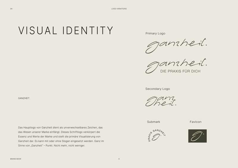
Our collaboration started with an in-depth workshop. Together, we explored the core values of the practice to shape both its visual identity and its name: Praxis Ganzheit. This name reflects a holistic approach to therapy and well-being.
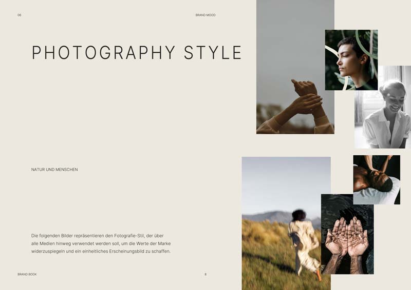
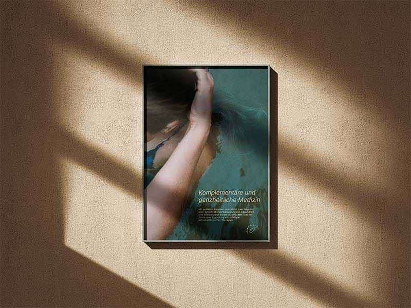
Next, I created a hand-drawn logo and symbol that feel both personal and professional. Warmth, clarity, and trust became the foundation of the design. A modern, mindful aesthetic informed every step—from typography and color palette to a carefully crafted photo concept and a focused photoshoot. Each image highlights the calm, grounded energy of the practice.
I designed the website to be intuitive and responsive. Subtle hover effects and smooth navigation enhance the user experience, making the digital space feel as welcoming as the physical one. In parallel, I devoted special attention to print materials. The business cards, for example, feature thoughtfully chosen paper textures and colors, offering a tactile expression of the brand’s values.
Today, Praxis Ganzheit presents a cohesive and meaningful identity. It flows naturally across all touchpoints and expresses a modern approach to therapy—one with heart, clarity, and intention.

From vision to execution.
A glimpse inside. Find some selected snippets from the brand book